

Nuuk
GTM Performance
Nuuk makes personal cooling feel like a design object, portable fans with the confidence of consumer tech. Launching into an unglamorous category, the brand needed imagery that created desire before it explained utility. Our brief: give a humble appliance an unmistakable point of view.
The launch world is colour-blocked and unapologetic, black hardware on signal red, teal stages, surreal meadows. Each product was rendered with obsessive finish, then placed in scenes strange enough to remember, because a fan only becomes a brand when its image refuses to be generic.
Alongside the renders, we produced lifestyle film built for the feed, fans clipped to waistbands, carried through summer streets, honest content that shows the product living its actual life without ever having to shout.
Brand and performance were designed as one system from the start. The same assets carry organic presence and paid campaigns alike, giving Nuuk a unified identity that feels premium at the brand level and converts with equal conviction at the performance level.
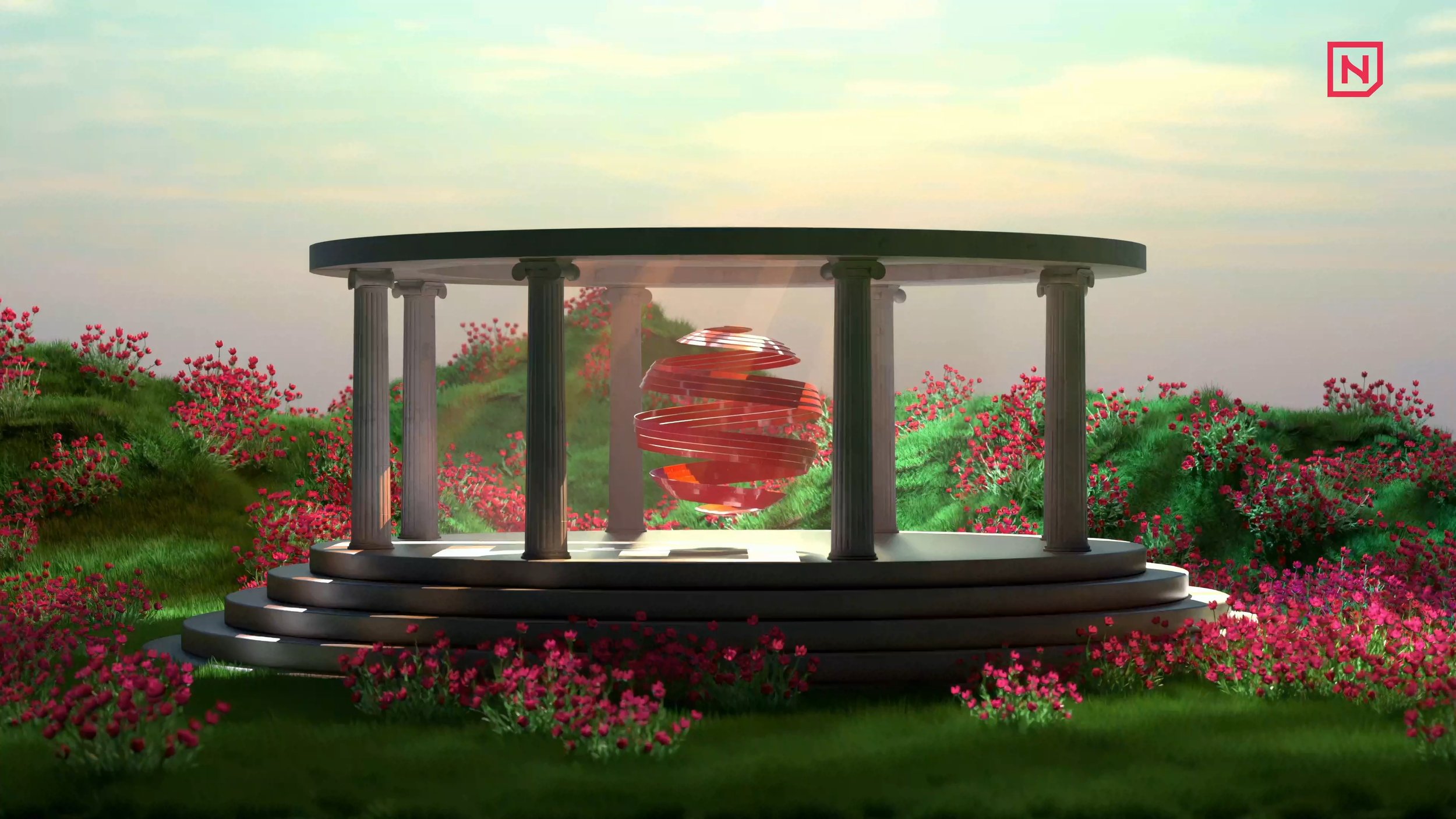
The gamble was treating a seasonal gadget like a flagship, and it changed how the brand was received. Nuuk arrived looking established, confident and collectible, which meant conversations started with desire rather than price, exactly where a young challenger wants its category talk to begin.
Consistency does the compounding: one red, one typographic voice, one temperature of light across renders, film and stills. Every touchpoint reinforces the same object-of-desire logic, so wherever the product appears, on a shelf, a feed, a case, it is unmistakably Nuuk.
What began as launch content became the brand's permanent visual estate. New products now step into a world that already exists, inheriting its confidence on arrival, and the audience greets each drop like a familiar character returning rather than a stranger asking for attention.