Kass
Brand Design & Launch
Kass begins from a quiet conviction: skin carries its own intelligence, and a formulation should collaborate with that biology rather than shout over it. The science was sound and the philosophy was clear. What the brand needed was a visual language with the same composure, an identity that feels engineered and alive at once.
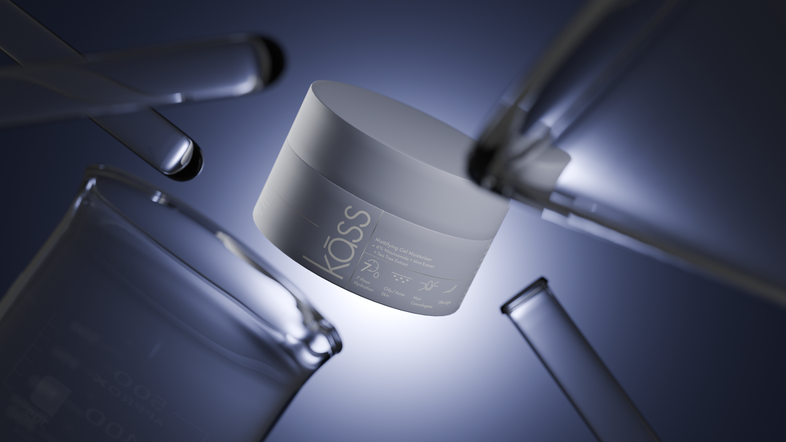
We built the launch imagery like a laboratory that dreams, macro botany, glass, water held a breath before it breaks. Every frame balances the clinical and the poetic, so the product reads as science you can trust and beauty you can feel, simultaneously.
For the social feed, the same stillness was recomposed into scroll-native rhythms, slow reveals, breathing macro loops, quiet typography, gentle proof that a skincare brand can hold attention on Instagram without ever raising its voice.
Materials carry meaning here: sage glass, brushed silver, stone and stem. We studied how each surface takes light the way a chemist studies actives, because in premium skincare the texture of an image is read, fairly or not, as the texture of the product.
The launch positioned Kass exactly where it wanted to live, between the dermatologist's shelf and the design magazine. Early audiences responded to the restraint itself, and the brand entered the conversation not as another serum but as a point of view about skin.
Proportion became the brand's quiet signature. Golden-ratio grids, specimen layouts, and negative space give every composition an underlying order, the visual equivalent of a well-run lab. Nothing decorative survives the edit; whatever remains in frame is there because the formulation philosophy demanded it.
A launch identity is a promise about everything that follows, and this one set the bar deliberately high. Kass now owns a recognisable calm in a noisy category, a visual composure that tells its audience the product thinks as carefully as it looks.